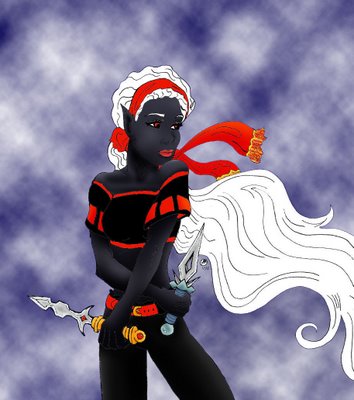
ugh, metal
This is my new color Kaylee picture... I HATE metal... I can't make things look shiny and this makes me very sad. Also, I think her head may be a wee bit big. I swear it looked better when I drew it, but I'm probably dillusional. Luckily her scarf is totally awesome. I think it may be the only thing I actually like about this picture.
 As a side note, I have somehow been suckered into running a Spirit Halloween store for 2-3 weeks to give the DSM some time to find a store manager. This means I am exausted. If I don't find an assistant manager by the end of this week I will have to work open to close every frelling day because the guy who's been helping me out goes back to Orlando on Sunday ><>
Also, does anyone know how to make an actual banner for these blogs? I need to make this site look better.
More ramblings later. Sleepy time now.


6 Comments:
For some reason, her head does look larger in the photoshop version than in the drawing. Maybe giving her skin a 3-dimensional look to it is the reason for the change.
And, because I do love those off-topic questions/comments...
Do you still read much of the X-Men stuff? Because I read the graphic novel Rogue Nation which Mike picked up recently, and I was wondering if you think Magneto's resemblance to Hitler is intentional? (Not physical resemblance, of course.)
I'm not sure, I haven't read it - you'll have to loan it to me so I can tell you =P
Very nice looking.
Cheers!
shawn - thanks :)
Her head does look bigger and the coloring is weird - awesone scarf.
Sounds like you will be working around the clock, hope the raise was a really, really good one.
Post a Comment
<< Home